Last analysis expected a pullback to last a few days, but price has continued higher.
Summary: There is an upwards trend in place, but it is becoming extreme. Use the narrow channel on the hourly chart; while price remains in the channel, the target for intermediate wave (3) to end is at 2,280 – 2,282. If price breaches the lower edge of the channel with downwards (not sideways) movement, expect a brief shallow pullback has begun. Corrections are an opportunity to join the trend.
Last monthly chart for the main wave count is here.
Last weekly chart is here.
New updates to this analysis are in bold.
MAIN WAVE COUNT
DAILY CHART
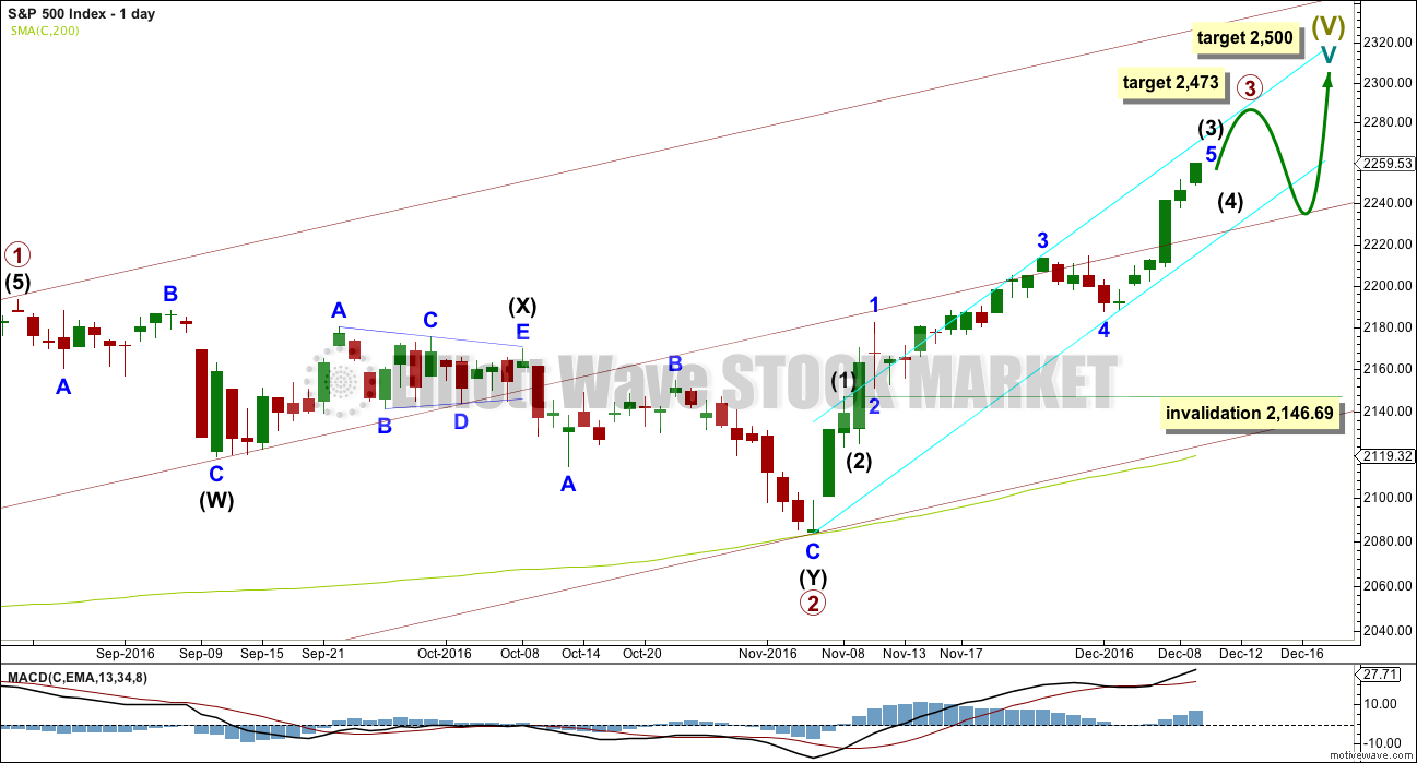
Cycle wave V must subdivide as a five wave structure. At 2,500 it would reach equality in length with cycle wave I. This is the most common Fibonacci ratio for a fifth wave for this market, so this target should have a reasonable probability.
Cycle wave V within Super Cycle wave (V) should exhibit internal weakness. At its end, it should exhibit strong multiple divergence at highs.
Within cycle wave V, primary waves 1 and 2 may be complete. Primary wave 3 may be over halfway through and is now exhibiting stronger momentum than primary wave 1. It is possible primary wave 3 may fall short of the target and not reach equality in length with primary wave 1.
Within primary wave 3, the upcoming correction for intermediate wave (4) should be relatively brief and shallow. Intermediate wave (1) was over very quickly within one day. Intermediate wave (4) may last a little longer, perhaps two or three days, and may not move into intermediate wave (1) price territory below 2,146.69.
At 2,473 primary wave 3 would reach equality in length with primary wave 1. This Fibonacci ratio is chosen for this target calculation because it fits with the higher target at 2,500.
When primary wave 3 is complete, then the following correction for primary wave 4 may last about one to three months and should be a very shallow correction remaining above primary wave 1 price territory. Although primary wave 3 has now moved above the end of primary wave 1, it looks like primary wave 3 needs to move higher to allow enough room for primary wave 4 to unfold. For this reason, if a pullback begins here, I would not yet expect it to be primary wave 4.
The maroon channel is redrawn as a base channel about primary waves 1 and 2. Draw the first trend line from the start of primary wave 1 at the low of 1,810.10 on the 11th of February, 2016, then place a parallel copy on the high of primary wave 1. Add a mid line, which has shown about where price has been finding support and resistance. This may provide support for any pullback here now that price is back above the mid line.
HOURLY CHART
Intermediate wave (3) may still be incomplete. Use the narrow pink channel about minor wave 5 to indicate when it is over. It will be an indication intermediate wave (3) might be over when this channel is breached by downwards (not sideways) movement.
At 2,280 minor wave 5 would reach 1.618 the length of minor wave 1. Minor wave 5 has passed equality in length with minor wave 1, so this is the next Fibonacci ratio in the sequence.
At 2,282 minute wave v would reach 0.618 the length of minute wave iii. This gives a two point target zone calculated at two degrees.
Expect price to keep rising while it remains within the pink channel. When the channel is breached, then intermediate wave (4) may have begun. Intermediate wave (4) may not move into intermediate wave (1) price territory below 2,146.69.
TECHNICAL ANALYSIS
WEEKLY CHART
Click chart to enlarge. Chart courtesy of StockCharts.com.
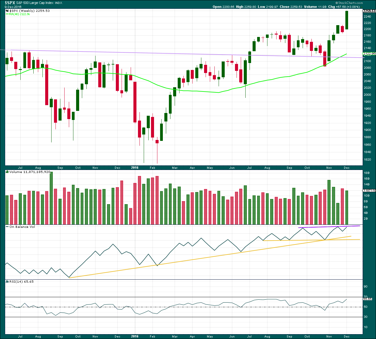
Another strong upwards week comes with a slight decline in volume, but volume is still relatively high.
On Balance Volume may find resistance at the purple line and this may force intermediate wave (4) to arrive earlier than expected. If OBV breaks above this line next week, that would be a fairly bullish signal.
RSI is not yet extreme. There is room for price to rise.
DAILY CHART
Click chart to enlarge. Chart courtesy of StockCharts.com.
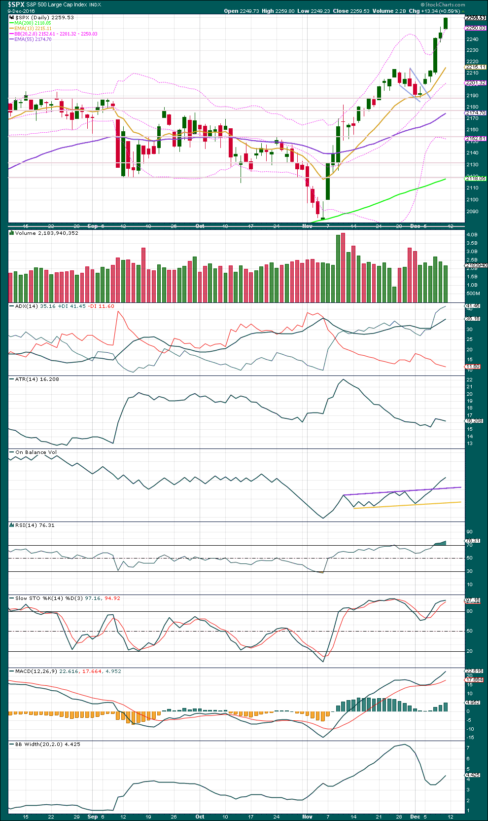
The target using the measured rule from the pennant pattern is 2,318.
Three days in a row of price closing above upper Bollinger Bands indicates this upwards trend is extreme. Normally, an expectation of a reversion to the mean would see a pullback here, but it has been noted recently that this upwards trend is not behaving normally. It appears to have an overabundance of exuberance, and surprises have been to the upside.
The last two sessions come with price moving higher on declining volume. This would also normally indicate a pullback, at least a short one to last a day or so.
ADX is increasing, indicating an upwards trend. But it is now over 35 and so extreme.
Normally, during an extreme extended trend, some divergence with Stochastics and preferably RSI may be used to indicate a pullback to relieve extremes.
RSI is extreme, but does not yet exhibit any divergence with price. It does not have to exhibit divergence before a pullback. But if divergence is seen, then the probability of a pullback increases due to weakness in bulls.
Stochastics is extreme and exhibits single small divergence with price. If Stochastics remains extreme and price continues higher, then if it exhibits multiple divergence with price, that would be a stronger indication of weakness.
MACD is bullish. Bollinger Bands are widening. The upwards trend has shown a burst of energy at the end of this week.
With indicators extreme and some small divergence, it would be reasonable to expect a pullback here or reasonably soon. The best method would be to use trend lines to indicate a change.
VOLATILITY – INVERTED VIX CHART
Click chart to enlarge. Chart courtesy of StockCharts.com.
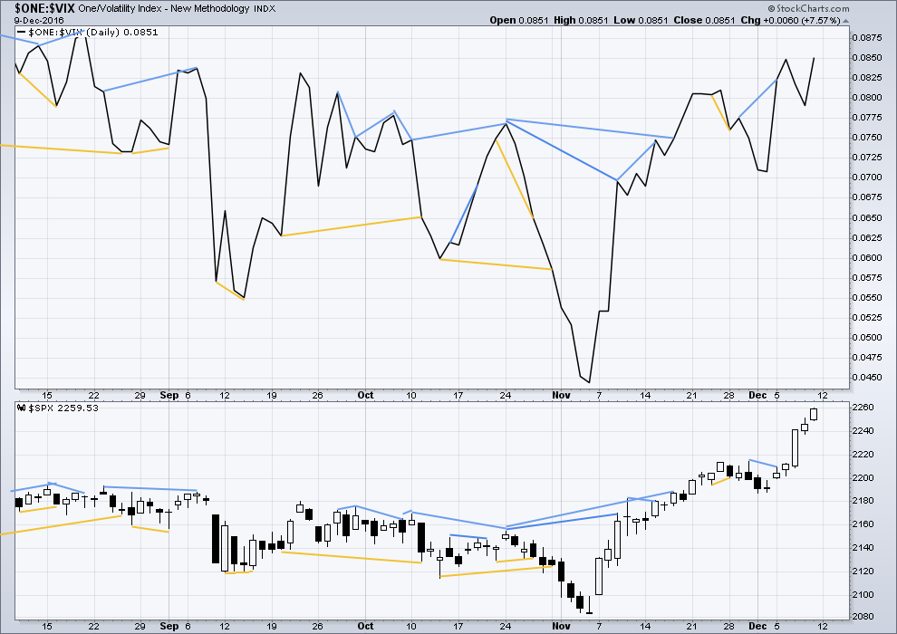
There are a few instances of multi day divergence between price and inverted VIX noted here. Bearish divergence is blue. Bullish divergence is yellow. It appears so far that divergence between inverted VIX and price is again working to indicate short term movements spanning one or two days. While this seems to be working more often than not, it is not always working. As with everything in technical analysis, there is nothing that is certain. This is an exercise in probability.
The bearish divergence noted between price and inverted VIX in last analysis has not resulted in any downwards movement. This is highly unusual because as price moves higher volatility normally declines but for two days volatility showed some reasonable increase. This divergence can only now be assumed to have failed because it has not resulted in any downwards movement.
No new divergence is noted.
BREADTH – AD LINE
Click chart to enlarge. Chart courtesy of StockCharts.com.
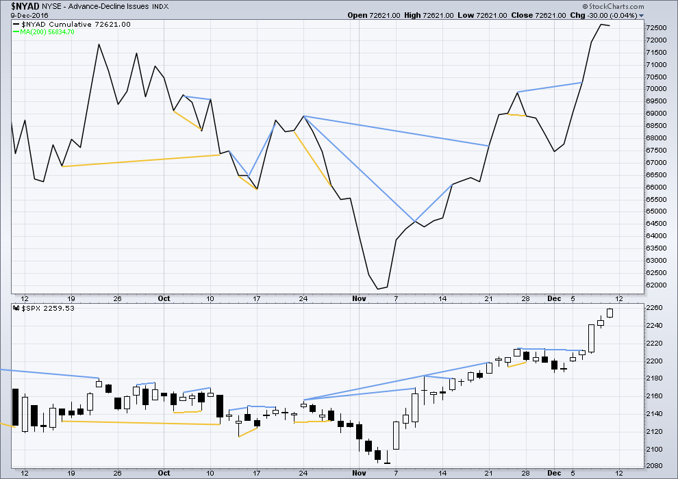
Short term bullish and bearish divergence is again working between price and the AD line to show the direction for the following one or two days.
There is longer term divergence between price and the AD line, but like inverted VIX this has proven reasonably recently to be unreliable. It will be given no weight here.
The AD line declined as price moved higher for Friday. The upwards movement for price does not have support from market breadth. This divergence is bearish and may be followed by one or two days of downwards movement.
DOW THEORY
Major lows within the old bull market:
DJIA: 15,855.12 (15th October, 2014) – closed below on 25th August, 2015.
DJT: 7,700.49 (12th October, 2014) – closed below on 24th August, 2015.
S&P500: 1,821.61 (15th October, 2014) – has not closed below this point yet.
Nasdaq: 4,117.84 (15th October, 2014) – has not closed below this point yet.
Major highs within the bear market from November 2014:
DJIA: 17,977.85 (4th November, 2015) – closed above on 18th April, 2016.
DJT: 8,358.20 (20th November, 2015) – closed above this point on the 9th of November, 2016.
S&P500: 2,116.48 (3rd November, 2015) – closed above this point on 8th June, 2016.
Nasdaq: 5,176.77 (2nd December, 2015) – closed above this point on 1st August, 2016.
Dow Theory Conclusion: The transportations indicate an end to the prior bear market. The transportation index confirms a bull market.
This analysis is published @ 11:28 p.m. EST on 10th December, 2016.

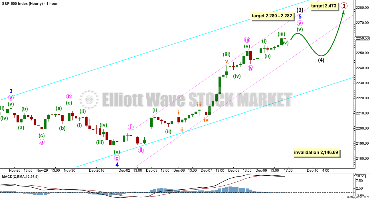
It looks like today price is bouncing off the lower edge of the trend channel. It’s still within the channel so I won’t expect that intermediate (4) is here yet.
Looking at the daily chart I still would expect primary 3 to move higher, there is not yet enough room for primary wave 4 to move into and remain above primary 1 price territory.
The trend is still up, until proven otherwise. If price breaks below the lower edge of this small pink channel with downwards movement (not sideways) then expect intermediate (4) has arrived, use it as an opportunity to join the trend. Don’t expect it to last too long.
I’ve adjusted the labelling within minor 5 today. Now the strongest portion is the middle of the third wave, not a fifth wave. This is more typical of the S&P. But some good Fibonacci ratios are lost I think, I’ve not yet checked that out.
Because this trend is now extreme if any members are long here it is essential that you look out for an upcoming change and exit there (if your strategy is short term).
If any members are looking to enter long, still waiting on the sidelines and didn’t take the end of minor 4 as an opportunity to enter, then please be very careful. You’re entering the trend late. Use stops, always! Invest no more than 3-5% of equity on any one trade.
Failure to adhere to these two most important rules places all the equity in your account at risk. Manage risk.
Extremity seems to be the name of the game these days for sure. Silver is trading near the top of its BB and Gold is trading near the bottom. I had initially interpreted this as weakness in the white metal but I am starting to think I am completely wrong on that score. For one thing, Silver has been consistently stronger than gold the last several weeks. Furthermore, is it possible that all the bullishness we have been seeing in other sectors are about to similarly be displayed in PMs? This would portend a rocket of Gold price from near the bottom of its BBs to smashing through the top the next few weeks. With silver already kissing the top of its upper BB, maybe its price is about to chart new territory when it comes to trading in rarefied air.
Have a great evening everyone ! See ya Wednesday after Frau Yellen.
IWM printed its above BB doji last Friday so it could possibly lead the way in the next correction. DJI pretty much ignored that last move down on November 28 with mostly sideways consolidation so we could see a repeat…
I have been so intrigued by the price of action of so many charts above their BBs that I went back a few years looking at charts to see if I could find anything similar. We are talking about not even a respectful tag a the 13 dma after an upper BB penetration, to say nothing of failing to do so after multiple penetrations. DJI seems to want to print yet another above BB doji today. There are some very strange things happening in the markets.
We really should see DJI tag the 13 day sma at around 19,300.00 on the move below the BBs. If it does not we are much closer to a top than most folk think imo…
A big move is coming in PMs. Take a look at this chart of the triple bull Gold miners ETF, NUGT. This is very serious compression and if price action means anything anymore, there is an explosive move just ahead, probably to the upside based on current trader sentiment. Of course nothing is certain and sentiment could become even more extreme with a downside break….
If it’s to the upside, then the S&P may move strongly lower. That may be the start of primary wave 4.
If it’s to the downside then it may be a blowoff top for the S&P to end primary 3.
Just possibilities.
Am I the only one seeing all these charts with price action above the BBs these days?
It is really starting to make my head spin how many there are. I was looking at the energy sector and wow! APC, XLE, OIH, USO….such bullishness in the air!!
Multiple charts continue to exhibit atypical trading patterns in remaining multiple standard deviations away from mean reversion. Here is another of IWM. Ordinarily the doji above the BBs would be a signal of impending reversal but not so certain these days. Of late that usually reliable signal has been rendered null and void. It will be interesting to see if the anomaly continues.
Peter Temple had also been calling an ending diagonal in SPX and had given a maximum of 2237 for the third wave. After we exceeded it he took another look and determined he had failed to account for the fact that all the sub-waves must be zig-zags. He now jokingly refers to it as the “Never Ending Diagonal”. His count now is more like Lara’s, except she sees an impulse up unfolding. He thinks we will be done early 2017 at the latest. I think it depends on how deep the forth wave is. If it is not deep enough to dispel enough of the current bullish sentiment the fifth wave up could indeed be a rather quick affair with a swift and brutal reversal after the final top is in. Everybody’s eyes are now firmly fixed on SPX 2500.00
DJI 20.000.00 is also in my opinon a foregone conclusion – nice fat round numbers!
I’m looking at my monthly chart here and I’m struggling to see how this fits into the bigger picture.
Specifically, I can’t see where he would see the first and second waves of the ED.
Yep. I had the same thought. Peter is definitely a wide angle view kind of guy and does not have the same kind of finesse in detailed wave analysis that you possess. I like to keep and eye on what he is saying as a “what if” kind of scenario. I was intrigued by the fact that his wave numbers, if nothing else, are now so similar in that he also sees a third wave to the upside incomplete so the big picture view does not change.
Speaking of trend-lines, a number of important ones were smashed this past week, highlighting the remarkable level of optimism that that has taken hold of the masses.
There is something however quite sobering about all this. We see a market skyrocketing higher based on nothing more than hopium, and persistently divorced from all economic reality. One of the recent reports from the BLS, one of the most morbidly dishonest of the reporting agencies, inserted a little asterisk next to its report of a 7% increase in retail sector services. On checking the asterisk what does one discover? They have absolutely no data to support the reported figure and that it is entirely made up! This is a stark testimony to the death of investigative reporting in the US. It has gotten to the point now where I cannot stand to listen to the drivel coming out of the so-called main stream media. The one program I used to watch, the PBS News Hour, has now joined the propagandistic balderdash reporting on “Fake News”. I was very sad to see it happen, and after decades of watching that program have now walked away in disgust. If Jim Lehrer and Robin McNeil were still around this would have never happened. Jim’s leaving a few years ago marked the end of that program’s stellar legacy of independence and trustworthiness. We should have seen this coming when they changed the name. I cannot believe I was so stupid as to continue watching it. PBS is a propaganda machine, plain and simple. They have now revealed their true colors and the program has become nothing more than another example of journalistic prostitution. The fact is that all the reporting outlets that are not alternative have become hopelessly corrupt and compromised. You will learn little that is true or useful by listening them. It is absolutely stunning that the US markets, in the face of the imploding bond market, demand destruction, and a yawning demographic cliff courtesy of an average of ten thousand baby boomers leaving the work place daily that we continue to almost daily make new ATHs in the equities market. It is ever more stunning that so few are pointing out the dis-connect from reality in what we are seeing. I for one have do doubt that were are going higher in the at the very least short, and possibly medium term. I also intend to trade accordingly and fully hedge my long volatility positions. Nonetheless, I remain very bearish. Stay alert!
Interesting musings there Verne. I agree with you re propaganda, it’s why I don’t pay much attention to the “news”.
Here in NZ the Granny Herald (otherwise known as the New Zealand Herald) last year began publishing “news” based on social media. What’s trending on FaceBook and Twitter. They’ve fired all or almost all of their old journalists, and hired young people fresh out of university to sit in front of computer screens and copy and paste to create content. It’s drivel.
From time to time they appear to be doing a little investigative journalism, but it’s shallow. I don’t know if their staff now know what journalism really is.
Meanwhile our police raided a true journalists home after he published a book which showed our current government involvement in dirty politics. The police raid took his source material, they were looking for his source. The judicial system has subsequently come down hard on police action, put plainly it was illegal. It sure does look like the police are a force unto themselves, and work in part at least to the directives of the government to do their wishes. Which is utterly corrupt. In a country known for it’s low levels of corruption.
Yeah, right.
Now we’re in an era of “post truth”. I hear this bandied about, and I’m amazed that it seems to be accepted with a shrug. Post truth? Really?
From a social mood perspective re Elliott wave, this is actually exactly what I would expect approaching a major multi generational turn.
Extremes of optimism, not supported by reality.
A few months back Lara posted an interesting link to a video by Chris Ciovacco in which he frequently cited the idea of “volatility to be ignored” as an important feature of his market timing model. At the time I thought it strange that ignoring volatility was something a trader would do and said as much. That video was a good example of why it is important to listen to what people smarter than you have to say even if you do not fully understand or even necessarily agree with it. Lara at the time in response to my musings correctly pointed out that Chris was talking about decisions being made more by long term investors than by traders and I think she was right. Although I have not followed the price action of SVXY much in my trading, I think its chart is a good illustration of what Chris was talking about, namely that volatility when used correctly can give a good indication of whether a long term trend remains in place. The chart of SVXY over the last three years or so is very much in keeping with Chris’ assertion in the video that there were only a few instances in the last few years when volatility actually signaled a meaningful near to mid term trend change. A cursory look at the chart of SVXY as a volatility gauge of market direction seems to suggest that as long as it stays above its 100 day ma it signals volatility to be ignored and an intact trend. Connecting the 2014 and 2015 highs suggest that we should see it move back above 100 before the next serious market decline arrives.